Brand Identity
Case Study: Mimi Hearing Technologies
Employer: Mimi Hearing Technologies GmbH
Location: Berlin, DE
Project: Mimi Brand Refresh
Role: Lead Designer
Mimi Hearing Technologies is a leader and innovator in personalized sound technology, which adjusts the music to an individual's unique hearing profile, and focuses on the health of hearing.
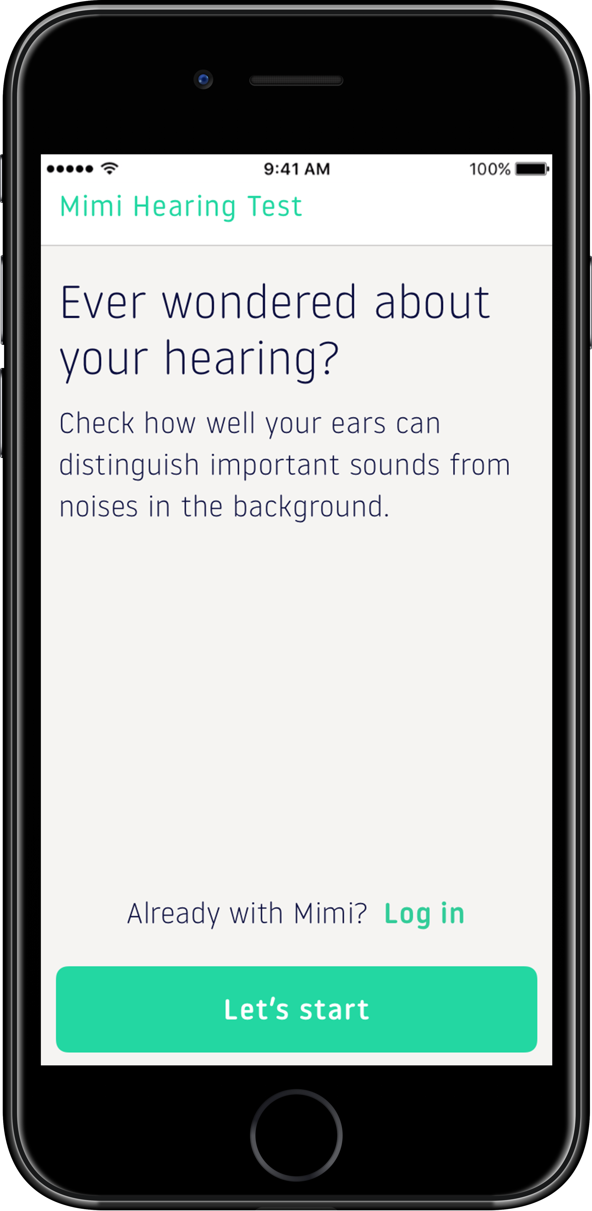
When Mimi was branded in 2014 by a design agency, the look was current and contemporary. Mimi was leading the market in a new and exciting technology that allowed users to have the convenience of doing a hearing test on their phones in the comfort of any quiet space they chose.
By 2017, having moved quickly to reinforce its position in the marketplace, a lot of things had been built without a governing structure or system to reign in the design repertoire. I was asked to clean up the existing property and create a refreshed brand that could act as an umbrella, allowing freedom to move around, but defining some clear guidelines that unified Mimi’s visual identity.


TL;DR
Objective:
Refresh the Mimi brand platform and create a unified visual system and guideline
Challenges:
An enormous catalogue of outdated random designs
Audit and refresh visual branding and guidelines without being too destructive
Get buy-in from Product, Design and Executive teams
Extend the refresh to typography and eventually partnership app and SDK assets
Deliverables
Brand audit
Develop a unified brand code
Develop a refreshed visual language and build a library for easy access across the company (especially the MarCom team)
Design, direct and edit a Brand film
Research and propose new typographic system for app and brand assets
Brand Audit
My process started with looking at all the existing assets and documentation since the last brand development of Mimi, which happened in 2014. I began gleaning as much information I could, of what Mimi was, how the concepts were derived and getting to know the brand as much as possible. To grasp Mimi, I had to understand the positioning, the values, the vision, the mission statement and get to know the competitive landscape. I quickly realized that the brand had a foundation, but the execution needed polish. I established a breakpoint and decided that an established “code” for Mimi’s brand could be inserted without too much harm or destruction, leaving everything else to the side, and branching a new path from there.

Brand Code
The Brand book was intact with useful information and guidelines that just needed some cohesion and minor patchwork. I pulled some key concepts from the brand voice, external voice, vision and value proposition, and added some ideas that would unify some principles I was going to propose. Together with an exercise that the design team had recently done developing the visual principles that would be the springboard for the product, I used these two components as the scaffolding for my idea: the “Mimi Code of Ethics.”
Mimi is:
1/ an experiential product *
2/ embraces imperfection
3/ science is cool
4/ how we use science is cooler
5/ inspired by nature
6/ not an aid. A companion
* This statement in my the “code of ethics” became the structure in which I would entirely base Mimi’s visual refresh.
“Mimi is an experiential product”
Visual Language
My idea, based on the existing brand guidelines and newly-minted code of ethics, was that Mimi is Empathic, Connected, Principled and Human. These attributes would be the groundwork for the refreshed visual language. The visuals centred on emotion, and the sentimental impact sound makes on a person’s life because Mimi is meant to be an experiential product. Also, Mimi’s DNA about imperfection, the whole idea that hearing loss is about the degradation of the human body (sometimes sped up with abuse), means that Mimi is built around deficiencies. I didn’t want to focus on close-ups and individual’s faces, especially people who look “perfect” (so no more models). I wanted Mimi to embrace irregularities. The previous brand visuals had people doing spectacular extreme sports, acrobatic feats or breakdancing and did not adopt this notion of imperfection (see the last image set). Rather, it highlighted how imperfect everyone else was and how the subject is extraordinary and super-human. My vision for Mimi was that it was not super-human; Mimi is human-centric. I developed a platform that gave the design team space for lots of interpretations. We would focus on the emotive qualities of an image — how does the image evoke emotion through sound?


Brand Film
Using the premise of the emotive qualities of an image, I started developing ideas of things that happen in everyday people’s lives. I looked for things affected by sound: a child’s laughter; the notification from your phone; a thunderstorm in the distance; waves crashing on a beach; the sound of a doorbell. All of these descriptions have images attached.
We hired a photographer, and we set out to take as many pictures of these descriptors as possible.
I assembled the series and edited the shots together and added foley to emphasize the soundscapes. The timing of the edit was vital, as some images needed several seconds, while others required less. My thought was to evoke emotion through these images and sounds; I wanted to sell the concept as a sound piece — riding that fine line between art and design — so that one could listen to the sounds without images, or look at the pictures without sounds, and garner the same ideas. Add Mimi, and it helps make the sounds of life clearer and last longer for everyone.
(headphones on, volume at a healthy setting)
Typography
Mimi’s brand and app had been using Open Sans as its official typeface for several years. The font’s application was dated and was starting to lose its appeal. Google had developed it for readability on screens in 2011, and while it does its job terrifically, it’s not a face for a brand like Mimi. First, it’s a super popular font, which means that Mimi was part of the literal millions who use the face. That doesn’t make for a good USP. Second, it’s very neutral. I wanted to find something that had character, individuality, and uniqueness. Like everyday people. We are all unique, and my feeling was that Mimi needed a good typeface to match.

My concept was to find a typeface that captured Mimi’s attributes of Empathy, Connectedness, Principled and Human. My process started with researching humanist sans-serif fonts with a geometric flair: I wanted to capture the scientific side of Mimi, but also focus on extreme legibility so that we could target our broad and diverse user demographic (18y-80y), especially on-screen. I abandoned it when I discovered the font Noway.
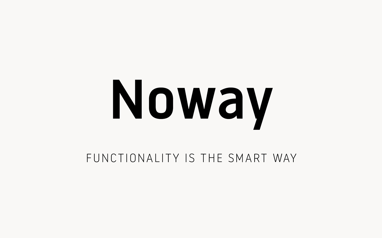

In doing my research, I found a Spanish foundry, Atipo, that had just finished an extended family for their new font, Noway. In detail, Noway is much more digital-oriented, with its large x-height and narrow width. In addition, its design for the letter “k” has the characteristics of a unique German type form (the “k” has a double junction; the bar extends out from the stem) — I liked giving a little wink & nod to the German-founded Mimi.

I contrasted that with another extremely legible font, Halyard, from another foundry, Darden Studio. Halyard has an abundance of personality, with versatility in its font family. I liked its humanist tendencies, but its text fonts were the thing that caught my attention. Halyard Text, optimized for legibility on screens and long paragraphs, was an exciting idea as Mimi wanted to move into surfacing more scientific and medical information as the user dug deeper into the informational side of their hearing health. Halyard would be perfect for top-line instructions, and as the user gleans more information, we could keep the legibility factor high, even though there might be more information on a screen.


In contrast, Noway was initially designed for Airport signage, so its characteristics were designed for legibility and squeezing some long words into confined spaces. Also, Noway had Noway [Regular] and Noway Round; I thought to myself, the rounded fonts will be for the more user-facing side in the app — narrow but legible for lots of information and rounded for a more empathetic, friendly tone. The regular face will be for the website and marketing material, in addition to print design.


Through experimentation and several rounds of contrasting the two font families in different scenarios, I presented to the design team. We put the typeface through its paces and eventually settled on Noway Regular and Noway Rounded being the new official typeface for Mimi. The fact that Noway’s extended font family meant that we could have an “easy-going,” friendly face for the front-facing app (Noway Rounded) and the face with the squared-off terminals (Noway Regular) would be for the website, marketing communications and decks.


Noway in use in the Web SDK.

Marketing Material.