Brand Identity
Case Study: with O
Employer: with O Inc./We Are O GmbH
Location: Berlin, DE
Project Length: 4 months
Role: Creative Director
With O is an AI-driven health tech startup that builds on-the-fly yoga-inspired video exercises for individuals with stigmatized health issues.
In some instances, one wants to present as a “T-shaped” designer; this is not one of those case studies.
I was hired as a freelance creative director to develop the company’s brand (platform, strategy, visual identity and name); visualize, direct and edit the immense video content (300+ videos); record and engineer the sound production (for 150 videos); and develop the UX, plus design the UI for the upcoming MVP. The timetable was hyper-aggressive: I had 6 months to complete the app design and brand; I was able to finish the project in 4 months (with very little sleep and lots of caffeine).

TL;DR
Objective:
Design and brand an MVP in 6m
Challenges:
Develop and build brand designs and strategy
Direct and edit content of 300+ videos
Record and engineer sound production
Develop UX and UI
Deliverables
Branding and naming development
Logo design
Colour Palette
Video Direction & Editing
Sound Engineering
UX design
UI design

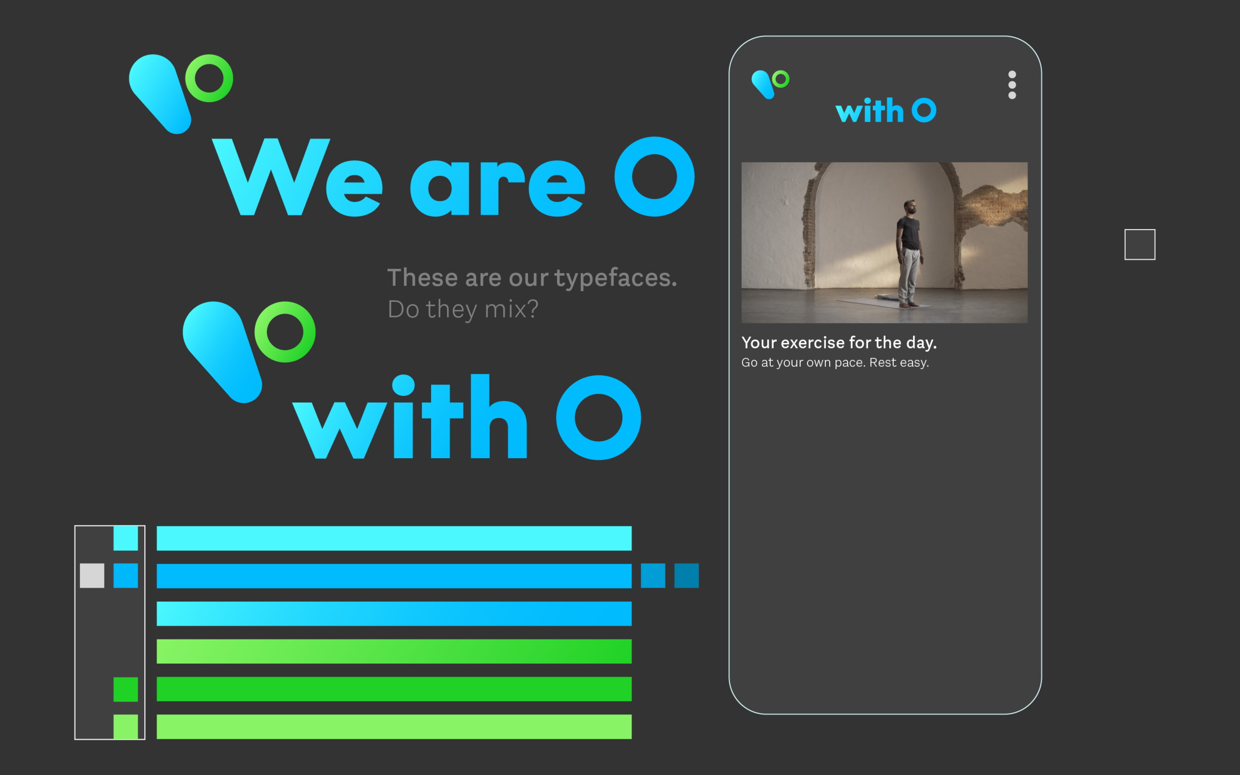
Branding and naming O
Starting with a branding questionnaire for the founders, I distilled the company's landscape, associations, audience and competition. The founders were keen on developing a holistic health company that was:
Open
Caring
Friendly
Yet taken seriously
These core attributes became the underlying theme that I used to develop the name, build the brand platform and design for the initial MVP.


The founders and I spent a (long) day together in a naming exercise that was a hybrid/mash-up of Google Ventures branding exercise and a construct of my own, where the team was able to come up with a narrow field of (17) names to choose. We whittled it down to a name that I had conceived earlier in the day (during lunch tbh): O. Just the letter O.


Based on what I had gleaned from the branding questionnaire, the letter O meant a lot of things to me:
Openness
Strong, yet friendly and gentle
Comfortable and comforting, like a hug
Holistic — complete from beginning to end
Plus, it gave the brand a lot of room (much like the counter of an O) for a multitude of prefixes for marketing fun: Your Well-Being with O; Exercise with O; Health with O.
Logo Design
I retained the attributes and themes discovered in the initial fact-finding survey. I went through an exhaustive process starting with 100 designs, narrowed down to 5 and finally to 1. And then another round of fine-tuning the logo for legibility and optical refinement.
Round 01
Round 02: Refinement.
Colour Palette
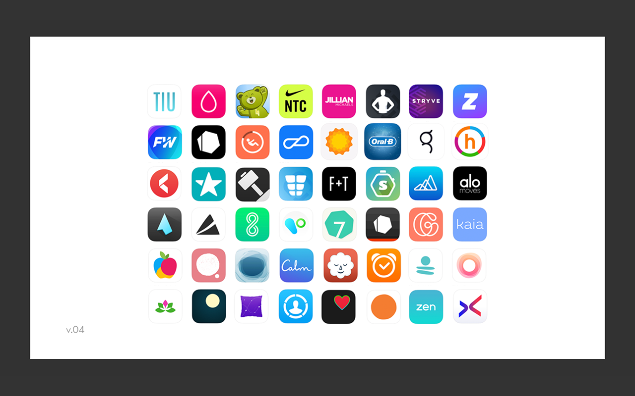
Another considerable task was developing the brand colours. Again, I used the brand attributes as the springboard for what the colours could mean. The founders wanted something current and contemporary, that could sit with their competitors, yet pop out in the crowd. As a health company, specific colours have meaning associated with that particular sector. Coupled with the brand themes, I was able to narrow the scope.


I presented a system that paired the brand attributes with colours and their general meaning (note: in Western culture — the company was based in Germany, but was a legal entity in the United States and was being built for that market). The two colours that were the most dominant were Green and Blue -
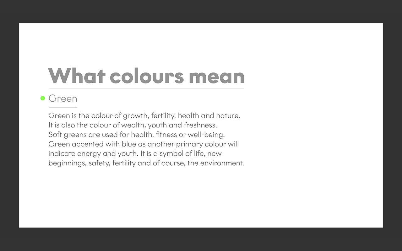
Green:
Green is the colour of growth, fertility, health and nature. It is also the colour of wealth, youth and freshness. Soft greens are used for health, fitness or well-being. Green accented with blue as another primary colour will indicate energy and youth. It is a symbol of life, new beginnings, safety, fertility and of course, the environment.Blue:
Blue is harmony, peace, calm and relaxation. Using soft blue has a calming influence. Health and hygiene companies use blue to promote freshness and cleanliness. Blue is also used to promote trust and security. Blue is synonymous with peace, freedom, intuition, imagination. It also inspires us to be loyal, sincere, confident, and intelligent.


Colour Presentation.

Final Colour Way with variations.
Also, I chose the yet-to-be-filmed yoga instructors outfit colours to be grey — heather contrasted with a charcoal/80% black. Any colour could sit on top of the videos, without competing for attention. This decision would be serendipitous when I started to develop the UI for the impending app (more on that soon).
Video Direction & Editing + Sound Engineering
With the help of a production company, I arranged that 3 cameras be set up with different focal lengths, synced together to capture and film the exercises performed by certified yoga instructors. The team filmed over 300 videos of yoga instructors doing 2-3' exercises. I then cut and edited the 3 Multicam shots together to highlight the focus-areas that users/viewers would eventually watch and follow. We settled on 150 videos, with another 150 set up for edit in the future.
The process then was rendered, encoded and put online so that the exercises could be automated and strung together into a cohesive and comprehensive lesson, built uniquely for the user. Each exercise needed a consistent beginning and ending that would look good when put together on-the-fly in the cloud. Doesn't that sound easy? (It wasn't).


(Headphones are required for the above video)
After editing the videos, we went into a recording studio and added vocals for the 150 exercises. Each exercise had 3 or 4 takes, which I edited and built into one master track for each of the 150 lessons. I then mixed the tracks, bounced them down to stereo outputs and lined them up to each video. The entire process took another 2 and a half weeks of non-stop audio action.
UX Design
The challenge of designing the UX for this particular app was building something that could be used by a large user group. The service was for a broad age group. It had to be gender-diverse — the founder and Chief Researcher, genuinely designed for everyone; ages 16-80; cis male, cis female, intersex, and trans individuals. In addition to an extensive onboard questionnaire, research needed baseline questions answered so that they could track progress and provide clinical evidence and feedback that the exercises were working.
Also, as this was a subscription-based service, we needed to present the information in a way that would build trust every step of the way. As this app is a new kid on the block, offering a service that asks personal questions to develop personalized and unique exercises for stigmatized health-issues, trust-building was essential.

Hired for the initial build phase, and not for the subsequent testing after the release, I came up with a simple solution that could be developed by UX designers in the future and would act as the bridge for the user and research: the O bot.
The O bot
In conceptualizing the feel of the app and service, I used the brand's core tenets and attributes as our foundational structure. I felt the best way to build a relationship with the user was to present as a friendly companion that was kind, slightly over-polite and a bit apologetic (like the generalized perception of Canadians — I had to sneak us in there somewhere). As the name of the company was with O, I came up with the O bot (like, Robot, but for O). The O bot asks questions, says beautiful things and makes terrible jokes.


UI Design
The Colour
Before Apple & Google decided to recently show the world what they had been building (dark UI), the lead developer and I decided that having accessibility as the tentpole for the app was paramount. I designed a stark grey background (65% black) that passed all accessibility tests, which allowed the colour palette to pop on top and make the typography stand out. An 80-year-old could see what the O bot was asking, but an 18-year-old would think that the look was fresh enough for them.
Also, the accessible grey matched my visual look for the yoga models in the videos we had shot the month before (as I mentioned). My design rationale: a subtle dark grey works with everything (look at this site).
The Framework
My decision to make the O bot the conversational centrepiece of the app meant that the bot needed a defined area to ask questions and the user (research and myself preferred the term "participants"). I built a structure that split the screen into 4 sections:
01 had a persistent logo that could (eventually) offer a function if needed, but initially a design decision based on brand reinforcement;
02 was the O bot's questionnaire area;
03 was the field for the participants (or "user") response;
04 offered pagination dots for the MVPs settings menu. Still, the area was designed for a future toolbar area for nutrition, historical data, exercise calendar, and community tools, as the service grew.

Typography
I chose a typeface with openness and a friendly demeanour in mind; again, I used the brand attributes to determine the look and feel of the face. The open counters and shape were necessary, as was a large x-height for easy on-screen viewing (in addition to being essential for O's older users). I also wanted something with a bit of character and charm, but not overtly, as the typeface was inherently and secretly Canadian. I settled my scope on Latinotype's Aestetico.

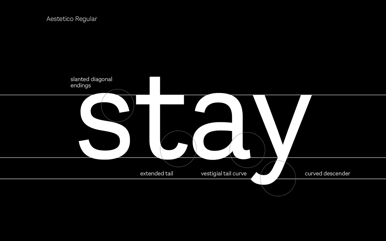


Aestetico is a versatile face with hand-drawn characteristics, open counters and a generous x-height for excellent on-screen legibility. An excellent example of the attention in detail is the bowl of the two-story "a" (which also has a unique little tail in the Regular face) and "g;" not entirely geometric and a little quirky, which provided me with the humanist touch.

I wanted O to feel like a conduit between people helping people. A geometric face would have felt cold. Besides, the participants (aka "users") we're going to read a lot of stuff during their onboard. I wanted the font to appear as friendly as the O bot itself.


Process.


Final UI Design.