Digital Design
Case Study: Mimi Hearing Technologies
Employer: Mimi Hearing Technologies GmbH
Location: Berlin, DE
Project: Mimi Hearing Test App redesign
Role: Senior Visual Interactive Designer
Mimi Hearing Technologies is a leader and innovator in personalized sound technology, which adjusts the music to an individual's unique hearing profile, and focuses on hearing health.
In 2017, Mimi partnered with the high-end German headphone company, beyerdynamic. Mimi had developed a SOC that allowed its accurate and widely trialled hearing test (over 1M users tested) to be inserted in a headphone so that the test and personalized hearing profile could be uploaded from a device to headphones via Bluetooth technology. It was quite a game-changer.
I was initially hired to help develop and visually design the 1.0 version of the hearing-test SDK for partners, which led to the eventual refresh of the UI toolkit and design of the 2.0 SDK, extending to the web app and brand aesthetic.

TL;DR
Objective:
Visually design the SDK and refresh the UI toolkit
Challenges:
Balance Mimi’s strategic goals and partnership requests and/or requirements
Unify existing systems and develop new visual guidelines
Lead the refresh and update the colour palette
Deliverables
SDK 1.0 Design
UI Animation
Colour system refresh
UI Component Library
SDK 2.0/Web App Design
SDK 1.0 Design
(The “Levi” sprite and the Icon Library)
My first assignment when I joined Mimi was to design the look and feel of a hearing test that was an extension of the beyerdynamic headphone controller app, which would have to be installed on phones to personalize customer's headsets. The hearing test results would determine the user's unique setting needed for sound clarity on their headphones. But there was a small problem: beyerdynamic refused any branding from Mimi's side. As you left the beyerdynamic headphone controller app, the user would enter a stripped Mimi Hearing Test portal, with no look and feel. The Design Lead and I brainstormed several options to curtail the de-branding, and we came up with what we felt was a good idea. Our version of Microsoft Clippy.


The concept when a little like this: what if we had a "Clippy" like, icon-based character/animated sprite, that walked the user through the hearing test instructions, animating what the current stages of the test were… and when the icon would transition between scenes, the animation would turn into a line that wiggled like Mimi's logo? It was subversive branding through recognition and repetition. It gave us the ability to desaturate the colour palette and remove all of Mimi's top-line branding from the portal. The best part was that beyerdynamic used the iconography within their side of the app as well. Win-win-win. We called our icon-based character, Levi for Levity: making light of a serious matter.
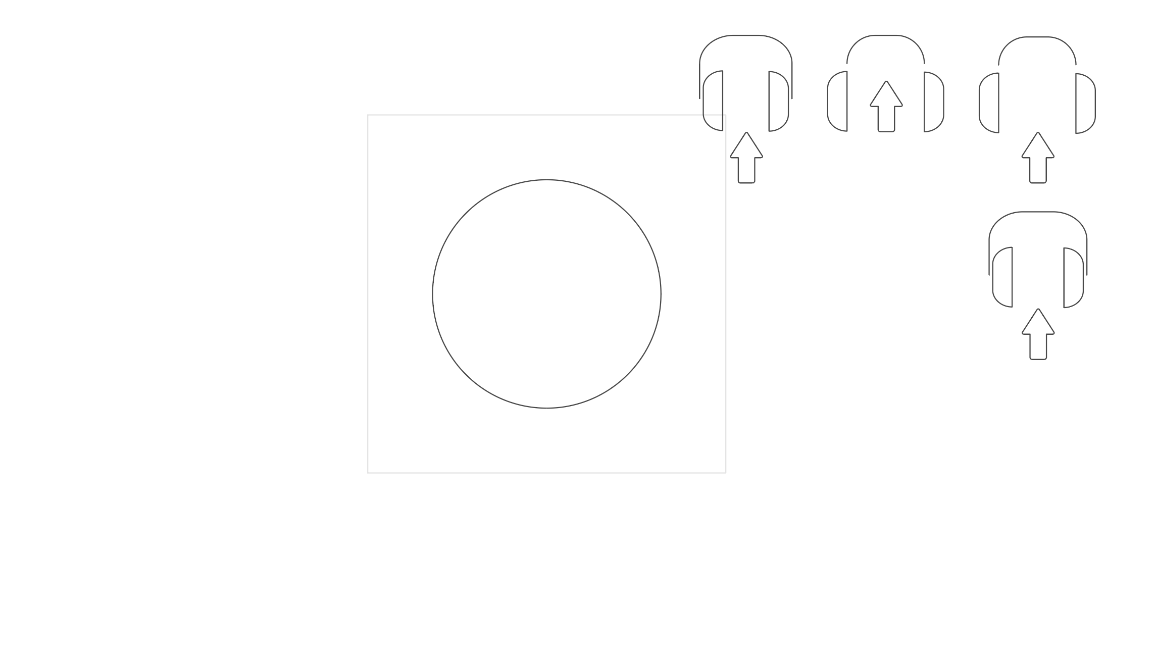
The next stage in the process was to figure out how Levi would sit on-screen. I determined early on in my research and experimentation that the icons should sit in a circle in the top 3rd section of the screen. This hierarchy would establish that the user should pay attention to the current stage of operations. A circular shape would give us a container that could easily transition, and it would offer some symmetry, as I developed an idea for the SDK hearing test button: a tappable circle. It differed from Mimi's Hearing Test app, which used a large rectangle for the hearing test button (Apple would later use the circular device for hearing tests in their own Researchkit SDK for iOS 13).


The evolution of Levi’s placement, layout and presentation of informational systems. The second last image shows a higher fidelity of the SDK hearing test button and the (probable) subsequent influence on Apple’s Researchkit imagery. *
The Icon Library
Using Mimi's brand values as the core tenant — human, caring, and empathetic — I felt an essential factor to consider was the stroke weight. Thicker lines invoked sentiments such as sturdiness, seriousness, and insensitive. Thinner strokes felt more compassionate. The minimalism conveyed an "easy-going" tone. My illustrative springboard was a "peace-signing" hand. I smoothed the corners and gave the curvature a 60° angle to convey a relaxed tone; hard, sharp edges feel utilitarian and didactic. That wasn't Mimi at all.


I designed 3 or 4 versions of every icon we used and presented them to the design team during our dailies. We would choose or give feedback for another round of icons. We started with around 20, and over 2 years later, we had close to 100 symbols and animations, explicitly designed for Mimi.
UI Animation
After designing the icon library, I had to build the animation of each icon transitioning in, turning from the Mimi wiggle into our "Levi" sprite. I experimented with different wiggles and with trial and error, locked a wiggle that looked cool, and built so I could control the in and out times. I used a technique that allowed me to draw-in the icons and offered me a modular-type system to swap the icons with ease. The animations were then rendered as animated GIFs and placed in a repository for the from-end devs to grab when building the screens. The devs noted that when the test started and finished, a delay from the server-side would slow response times, leading to bad user experience. I experimented with different "Levi" start-loaders (see the process below).
The Mimi Wiggle Animation
Frame 1: Early Levi and line rendering;
Frame 2: Process: Animation & Layout where I experimented with the Mimi line wiggle and transition animations;
Frame 3: The final lockup and line animation complete with final Levi icons.
The animated transition from beyerdynamic’s side of the app and entering Mimi’s hearing test portal was an example for testing purposes.
The Levi Loaders
Process of different proposed Levi Loaders. Version 1 is the Mimi Wiggle Line loader.
Version 2 is the Levi Dancing Loader. Version 3 is a staggered loader.
Colour System Refresh
Mimi's branding had not been refreshed for a few years and was starting to get a bit dated in addition to not being extensive enough for our growing library of UI elements. For instance, we didn't have a unified "alert" red; our branded Mimi "medical-mint" colour was looking a bit drab and didn't offer enough contrast for accessibility. The team lead knew that this was a mounting issue, and we eventually needed to start developing a new system, which would kick off the UI toolkit update.

Mimi Colour Way 2015-2018 RIP

Mimi Colour Way 2018 - Present
Process Stage 01 - Workshop Part 01:
I was tasked with developing a way we could, as a team, build a new system. We were in travelling to a design conference, and what a way to get inspired than to have an offsite, team-building exercise: the team would take pictures of the colour of real-world physical objects that represented Mimi's 4 central brand tenets: Empathetic, Non-conventional, Science-driven, and Honest.

The colour of honesty and trust (Lyon, FR)

The colour of empathy and science (Lyon, FR)
Process Stage 02 - Workshop Part 02:
I gathered the pictures from the team built a matrix for us to distribute where we thought each image should sit in the range between the words Empathetic, Non-conventional, Science-driven, and Honest.


Process Stage 03:
I took the matrixes and pulled the RGB values from each designer, which gave us a range of colours that were associated with the brand tenets. Next, I created colour themes that I shared with the team. I built Illustrator files with each interface element on its layer so that the components could be easily coloured with each item, which I distributed to the team, and tasked them to re-colour the hearing test app.
Process Stage 04 - Workshop Part 03:
Our 3rd colour-finding workshop was presenting the files on-screen and printed, having the team discuss the rationale for their choices. We sat with them, discussed the merits of each and dot voted our picks. At that point, my colleague and I took the files, pulled the colours and started playing, keeping in mind the notes we had taken from the critiques in the workshop.


Process Stage 05:
We started developing a loose system based on what we knew had to exist: a new primary colour for Mimi, a secondary colour and its tints and shades, and tertiary colours that would act as support. We agreed that Mimi needed a refreshed green that was vibrant enough to be offset against a cool "ultra" violet/purple. The combo looked very exciting and wholly contemporary. We started bumping up the saturation, making the mint and the violet pronounced on screens, adding to the modern, updated look. Also, we did extensive accessibility tests to make sure that the colours would pass.
As I was building the Hearing Test web app concurrently, I would develop components, apply colours and experiment contrasting the mint and ultraviolet with new colours for alerts and error states, tones for deselected buttons and shades for iconography.
An image of the work in progress, the fall of 2018. Note the new version of the Profile screen on the top row and the iOS Hearing Test version below. The colours are muted in the iOS version in comparison to the working version above. To the left, the final colour palette.
UI Component Library
In building out the new colour system, the journey led me into concurrently developing the UI toolkit while building out the screens for the updated Hearing Test web app. As I would design a new component, I would update our library and add it to Zeplin, so that the team could critique and we could make amendments. The first stage in the process was to audit the existing Mimi products and see the convergence and divergence of elements.
(click on images to expand views)


From that point, I was able to advise the design team on which elements to merge, update or too elaborate. Through team reviews and feedback, the items would eventually be added to the component library and merged into the working Hearing Test designs.
SDK 2.0 (Web Software Develop Kit)/Web App Design
In building the partnership SDK for beyerdynamic (we'll call that SDK 1.0 for ease of explanation), we used many elements and designs from Mimi's flagship product, the iOS Hearing Test app. In visually designing the web app, I was effectively building components for the 2.0 SDK that have continued development after I left Mimi in 2019. My process started with merging elements from the SDK 1.0 package and the iOS Hearing Test app and creating a hybrid that would evolve into the new designs and, eventually, the UI component library.
(click on images to expand views)


Mimi iOS Hearing Test App designs


Mimi Web Hearing Test process work


Updated process work.
Take note of the colour process. I started these designs before the colour system refresh, and you can see how the colour gets updated as we progressed with the workshops.
A demo of the web hearing test practice round.
I also designed the ui animations.
We also started to develop a new plot graph for the results of the hearing test. In the iOS hearing test app, first, the user would take a test. Afterward, their profile screen would appear with the findings, the relationship between others in the same demographic, and perhaps some recommendations (for instance, if the user has extreme hearing loss, we'd recommend that they see a specialist). The conceptual UX designers had developed an idea that after the user took the test, the profile screen surfaced a more precise presentation and deeper insights into the users hearing health. In designing the WSDK screens, I cleaned up the look and developed visual concepts, adapting them to our new colour system and adding ideas for the expanding UI component library that was being built simultaneously.

The Inverted Hearing Curve Results Designs
The conceptual UX designers worked closely with the R&D team designing what was called "a new paradigm" in how to present hearing test results to users. Without getting too esoteric, we usually, in the results of a hearing test, we see a curve that dips — the sharper the curve, the better the hearing.


* I’ll tell you the story if we meet in person ;-)