Print Design
MOJA Tea Gallery
As a principal designer at uomostudio, we were commissioned to design and brand a local Tea shop/gallery, located in the rear of an vacated hotel in Toronto, ON. The owners of the Tea shop wanted a branding system based of logo that had a distinctive, tribal-like character. (Above: rendering of potential storefront light box and signage)
After numerous revisions, the owners settled on what they felt was closest to the brief, a logo that had a tribal, yet unique feel (see below). The logo actually reads backwards — upwards, but has a hidden arrow pointing to the name of the gallery. The next stage was to design their business cards and eventually, their entire in-house tea line labels.
OCAD Graduate Showcase
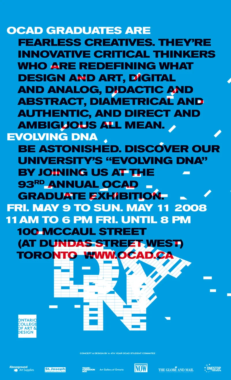
uomostudio successfully pitched and won the opportunity to design the print and motion campaign for the Ontario College of Art & Design’s 93rd annual graduate show (our alma mater). The project consisted of an extreme sensitivity both to type setting and working with a large number of stake holders acting as one client. A series of print pieces were designed to be released on three consecutive dates leading up to the show. The campaign included a staggered release in nationwide newspapers, a wheat-paste postering of the city, creating a motion piece for the transit system, and designing all the web collateral. The campaign was a huge success and opened the door for other graduates to design the subsequent annual grad show.
Pitch & Process
Foxy Production - Advertisements
After finishing Foxy’s typeface, logo and website, I was tasked to design their print ads for their international art magazine promotions for up-coming shows. Here is an example of their consistent look, utilizing the typeface I designed for them for the gallery’s re-fresh.
You Are Here - Art Show Brochure
I volunteered to design a brochure for the Ontario College of Art & Design University’s Curatorial and Criticism Masters class of 2011 for their final gallery show at the Art Gallery of Ontario. The arrows not only build the logo (“H” for “Here”), but also acted as a guide through the catalog and the museum.
Futureshock
Futureshock was the collaboration between uomostudio and two immensely popular DJs, Serious and Dopey (DMC World Champ!) to create a audio/visual mashup party. We set out to do a VJ/DJ jam where Serious and Dopey spin tunes plus scratch videos and clips that included motion graphics we designed just of the show (yes, they actually scratched the videos live). We designed the logo, flyers, posters and a promotional website for the endeavour. Here is a sampling of the print work accomplished.
Styles
Styles is one of Switzerland’s longest running event series and has built itself a solid reputation across the borders of Europe. Aiming at the extreme-sports oriented youth market, uomostudio was asked to redesign the brand and create an ever-changing visual language to be portrayed in the promotional materials issued before the events. These visuals are very vibrant, trendy & energetic and consequently communicate with the target audience effectively.


